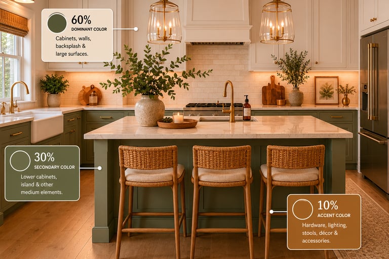
The 60/30/10 Rule
Discover how the 60/30/10 Rule can transform any room with balanced, cohesive color design. Learn how to use dominant, secondary, and accent colors to create beautiful, professionally styled spaces with confidence.
6/1/20263 min read
The 60/30/10 Rule: The Secret to a Perfectly Balanced Interior Design
Creating a beautiful room isn't just about choosing expensive furniture or following the latest trends. One of the simplest and most effective design principles professionals use is the 60/30/10 Rule. This timeless formula helps create balance, harmony, and visual interest in any space, regardless of your design style.
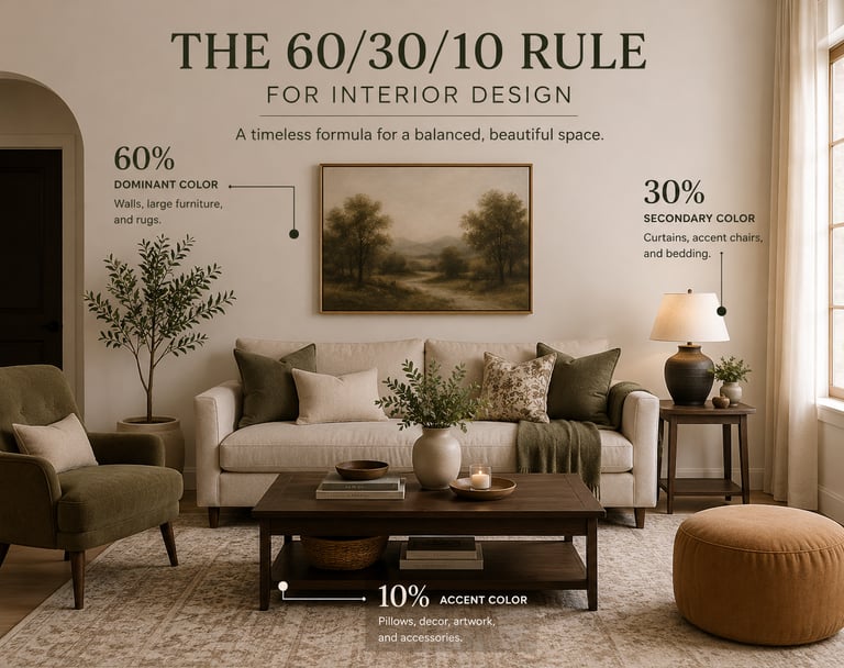
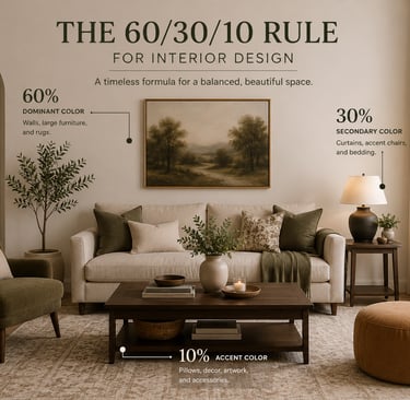
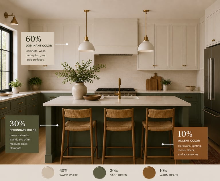
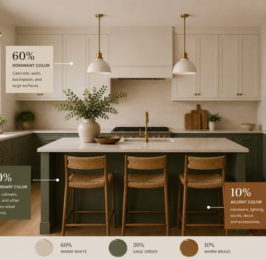
What Is the 60/30/10 Rule?
The 60/30/10 Rule is a color distribution guideline used in interior design. It suggests dividing the colors in a room into three proportions:
60% Dominant Color – The main color that defines the space.
30% Secondary Color – A complementary color that adds depth and contrast.
10% Accent Color – A bold or vibrant color that creates visual interest.
This approach creates a cohesive look while preventing a room from feeling either overwhelming or monotonous.
Breaking Down the Formula
60%: The Dominant Color
The dominant color serves as the foundation of your design. It typically covers the largest surfaces in the room, such as:
Walls
Large furniture pieces
Area rugs
Flooring
Neutral tones like white, beige, gray, or soft earth tones are popular choices because they provide flexibility and longevity. However, the dominant color doesn't have to be neutral—it can be any shade that establishes the overall mood of the room.
30%: The Secondary Color
The secondary color supports the dominant color and adds dimension to the space. This color often appears on:
Upholstered furniture
Curtains
Accent chairs
Bedding
The goal is to create contrast while maintaining harmony. If your dominant color is light and neutral, the secondary color may be deeper or more saturated to add visual weight.
10%: The Accent Color
The accent color is where personality shines. Used sparingly, it draws attention and adds energy to the room. Common places for accent colors include:
Throw pillows
Artwork
Decorative accessories
Lamps
Fresh flowers
Because it represents only 10% of the room's color palette, you can experiment with bold hues without overwhelming the space.
Example: Applying the 60/30/10 Rule
Imagine a modern living room:
60%: Warm beige walls, a neutral area rug, and a cream-colored sofa.
30%: Navy blue accent chairs and window treatments.
10%: Mustard yellow pillows, decorative vases, and artwork accents.
The result is a room that feels balanced, sophisticated, and visually engaging.
Why Designers Love the 60/30/10 Rule
It Creates Visual Balance
Without a clear color hierarchy, a room can feel chaotic. The 60/30/10 Rule ensures each color has a purpose and place.
It Simplifies Decision-Making
Choosing colors can be overwhelming. This formula provides a straightforward framework that helps homeowners make confident design choices.
It Works with Any Style
Whether your aesthetic is modern, traditional, farmhouse, coastal, or minimalist, the 60/30/10 Rule can be adapted to fit your vision.
It Prevents Trend Fatigue
Using trendy colors as accents rather than dominant features allows you to refresh your space easily and affordably when styles change.
Common Mistakes to Avoid
Using Too Many Accent Colors
Introducing multiple accent colors can dilute the impact of the 10% color and create visual clutter.
Ignoring Texture
Color isn't the only design element that matters. Incorporating various textures—such as wood, metal, linen, velvet, and natural fibers—adds depth and interest to the room.
Treating the Rule as Rigid
The 60/30/10 Rule is a guideline, not a strict law. Some spaces may benefit from slight adjustments depending on architecture, lighting, and personal preferences.
Final Thoughts
The 60/30/10 Rule remains one of the most reliable tools in interior design because it combines simplicity with versatility. By assigning clear roles to your colors, you can create spaces that feel intentional, balanced, and inviting.
Whether you're redesigning an entire home or simply refreshing a single room, this proven formula provides a strong foundation for achieving a polished and professional look.
The Cozy Grain
Rooted in comfort, styled for living.
Contact
Newsletter
The.cozy.grain01@gmail.com
© 2024. All rights reserved.